There's a thin blue smoke
In BBQ and crypto, failing to plan is planning to fail. Let's dig into this market!
Bull markets produce a lot of signal.
Oftentimes it’s conflicting, can lead to information overload, analysis paralysis, mental exhaustion, and eventually, mistakes.
When grilling with an offset smoker, the fire at first produces a ton of white billowing smoke that is filled with creosote, carcinogens, and a pretty bad odor.
One would assume that when smoking meat, the more smoke, the better, but this is a misconception.
The fire is simply “just getting started,” thriving off a heavy inflow of oxygen and finding its footing in a bed of black briquettes and splits of hardwood.
Smoking truly doesn’t start until the briquettes are covered in a light grey patina of ash and the hardwood turns black and breaks up into coals.
After this, the temperature pulls back from the 800 degree range to under 400 and from the smokestack emerges and thin blue smoke. It’s not like the noxious plume that angrily exits from the chimney of a coal fired locomotive. Rather, it’s more a hazy, near indiscernible light blue mirage of heat and smoke that a real BBQ fiend will recognize as the stuff that imparts a clean aroma and taste.
Now you can smell the entire flavor profile of the hardwood that is about to be imparted to the meat once the temp drops to 225 to 250 degree Fahrenheit range.
Now, you’re ready to grill.
The 2020 to 2021 bull market threw out a ton of signal and every corner of the market was filled with euphoria, unbelievably large capital inflow and the underlying belief that Bitcoin, altcoins, DeFi tokens, Metaverse tokens, play-to-earn blockchain games and DEX native tokens would fly past the moon and land valuation-wise somewhere near Mars or Jupiter.
Those were good times, and genuinely characteristic of crypto bull markets, numba went up fast, but came down even faster.
Bear markets are always way worse than investors expect and the demise of the most recent bull market was no outlier.
While it was painful, it looks like all the billowing, acrid smoke is gone, and now investors are tasked with picking up the scent of that thin blue haze. It’s difficult to discern, but once found, rewarding and well worth the search.
Let’s see if we can pick up the scent and determine whether it’s hickory, mesquite, cherry, peach, pecan, maple, apple, red oak, white oak, live oak, post oak, alder, or something else worth putting a brisket-sized investment on.
Where we were, vs where we are
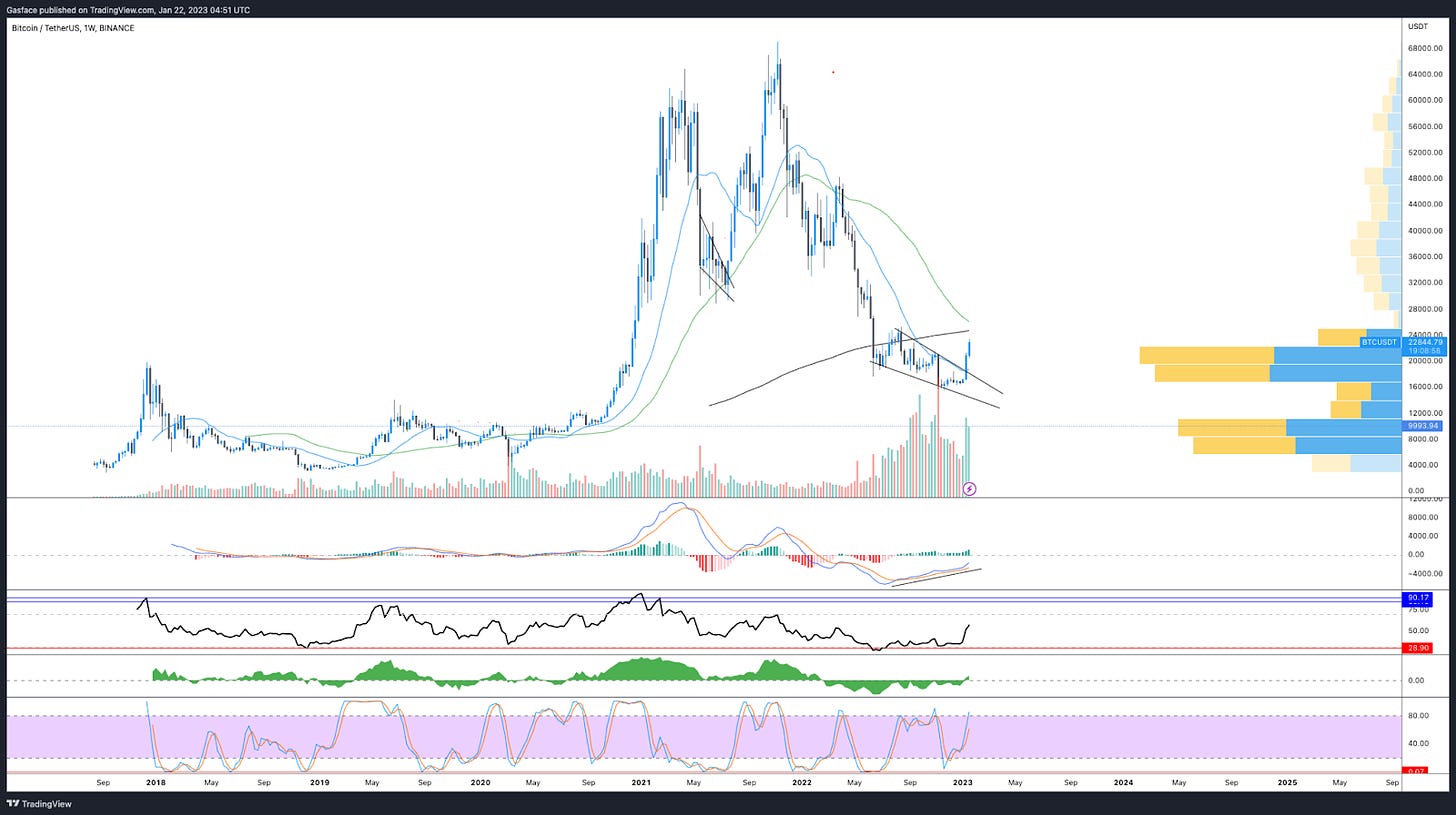
In Low’n slow is the way to go, I laid out my thesis for Bitcoin’s price action over a multi-month timeframe and this involved a discussion of the falling wedge on BTC. $19,500 was identified as resistance and $15,500 to $15,000 as support in the event of sharper downside.
Similar to the May to July 2021 falling wedge price action, BTC price followed a near-identical trajectory and in the past two weeks it broke above descending resistance and is in route to attack the volume profile gap in the $24.6K to $29K zone.
Because where I’m from the proof is always in the pudding, let’s look at some charts.
As shown in the 1-week chart above, Bitcoin managed a clean break from the falling wedge and price proceeded to push above the 50 and 200 EMA 12 days ago. On the weekly time frame (featured above), we can see that the next resistance cluster is in the $25,000 to $29,000 zone.
After a 37% move over a month, some degree of consolidation or a lower support retest in the $21,000 range wouldn’t be out of ordinary, but given the near trend change that BTC has achieved in terms of market structure (a higher high above $25,300), let’s look at other points of confluence to see if BTC price bottomed.
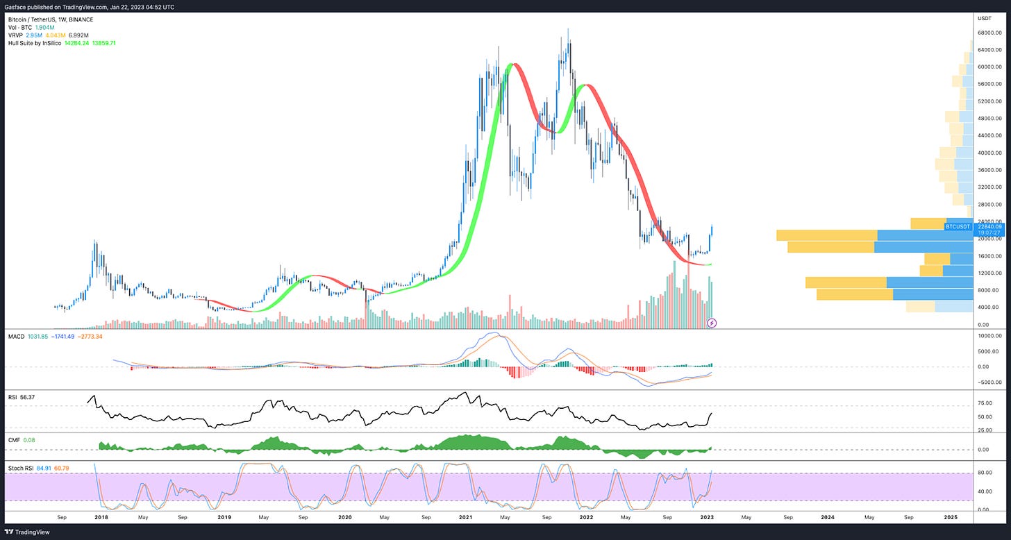
The weekly Hull Moving Average flipped green for the first time in 16 months
The Hull Moving Average aims to reduce the lag seen in traditional moving averages in order to keep a closer and more accurate pulse on the trend or momentum. This is meant to give a more accurate signal on when to enter and exit the market.
The longer-term HMAs are also used to confirm the macro trend, but the indicator isn’t meant to be used in isolation. When combined with other indicators it does provide some powerful insight into market momentum.
Have a look at the weekly chart above, notice the HMA has at last turned green and price is up 48% from the $15,300 swing low. Ideally, bullish traders will want to see the green ribbon of the HMA thicken and begin to pull closer to the candlesticks.
In previous analysis I’ve used the Guppy Multiple Moving Average (GMMA) to get deeper insight into the potential of a trend change. While the weekly GMMA has yet to flip green on the weekly timeframe, the daily timeframe tells a different story.
In the last 8 days the indicator crossed over from red to dark green and now bright green for the first time since Oct 4, 2021.
On-chain data takes a turn
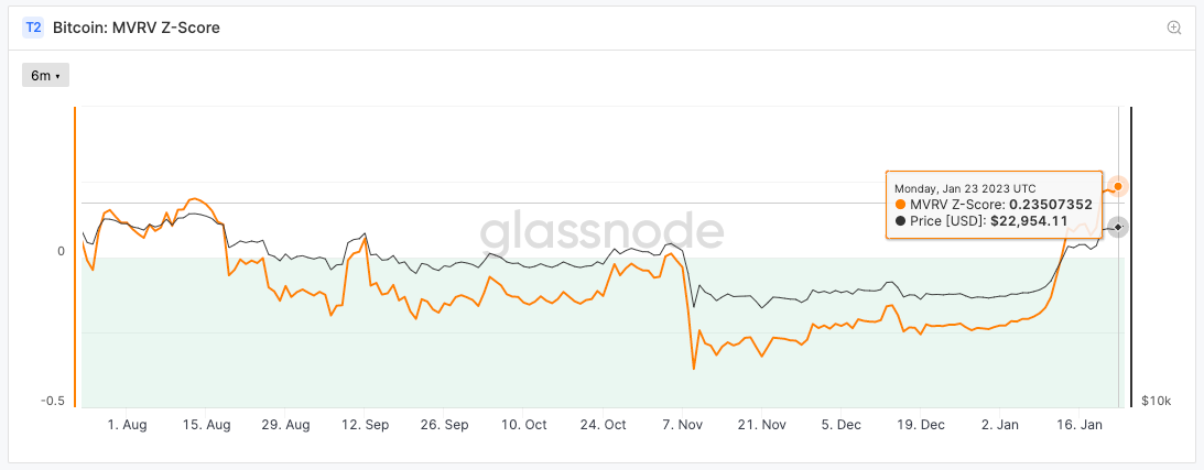
Bitcoin on-chain analysis is also beginning to flash some interesting signals. The MVRV Z-Score has at last popped out of the green “accumulation zone". The MVRV reflects a ratio of BTC’s market cap against its realized cap (the amount people paid for BTC compared to its current value).
It’s an easy indicator to read and keep track of. When BTC’s market value is measurably higher than its realized value, the MVRV enters the red zone and this points to a potential market top.
When the metric enters the green zone, it’s a signal that BTC’s current value is below the realized price, and is a sign that the market could be nearing a bottom.
As we can see below, the MVRV Z-score popped above the green area around Jan. 16.
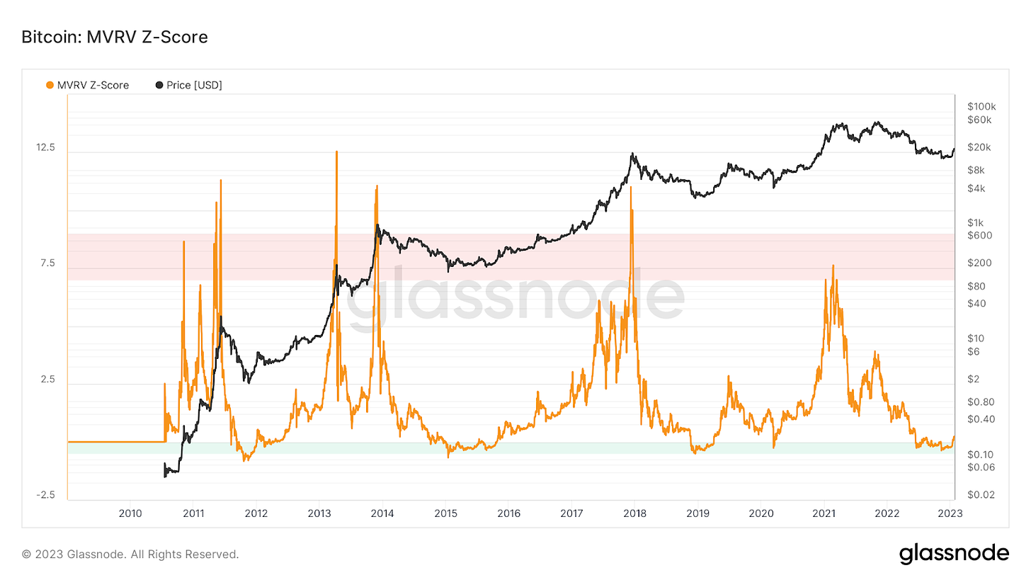
Zoom out and view the MVRV Z-Score on a multi-year time frame and you’ll notice that a Z-Score reversal tends to mark the market bottom and the potential start of a new cycle.
Obviously, BTC price is likely to consolidate and continue to meet sellers at key resistance levels, but the recent emergence of the metric from the green zone can’t be ignored.
Expand your horizons young padawan
Now, you can zoom in on a handful of Bitcoin price and on-chain metrics as much as you want and depending on your bent, confirmation bias will lead you to the theory of your desires…and possibly to rektage.
Bitcoin’s price move didn’t just happen on its own and it would be foolish to ignore what’s happening in macro. BTC price remains correlated to equities markets and what happens on the macroeconomic and regulatory front will continue to impact crypto prices.
December’s below expectation CPI print and the upcoming February FOMC and interest rate hike clearly provided the necessary investor sentiment boost to push prices through what had been a sticky zone for months.
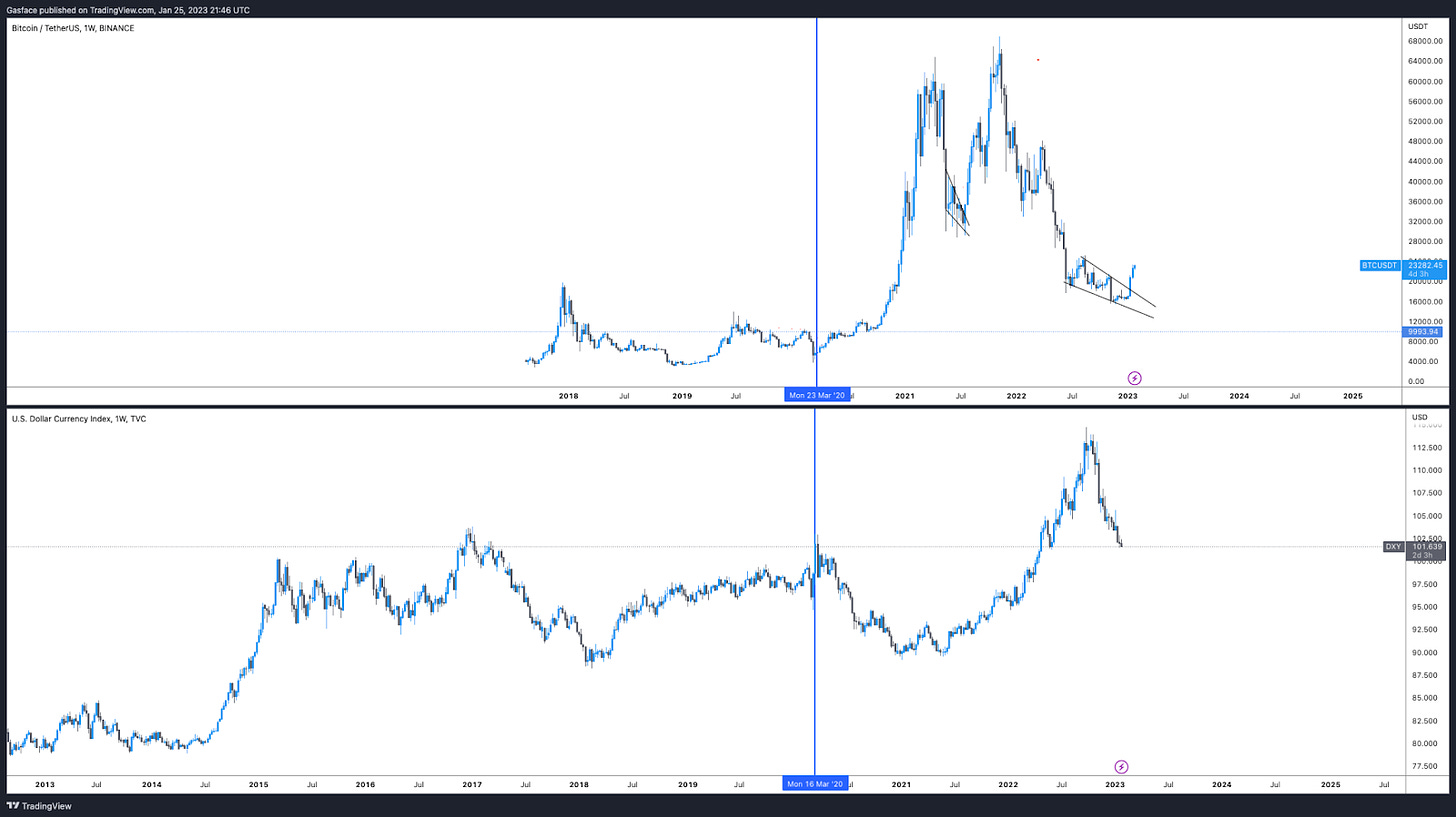
But, as shown below, BTC’s inverse correlation with the U.S. dollar index (DXY) says it all. Recently, DXY has been losing ground, pulling back from a September 2022 high at 114 to the current 101. As is custom, as DXY pulled back, BTC price amped up.
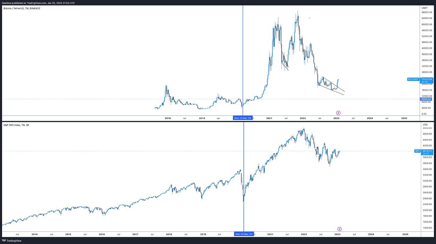
Bitcoin price also shares a high correlation with the S&P 500 and the Dow. Easy proof of this is shown below. One of the simplest strategies for keeping a pulse on BTC’s potential price path is to keep up a daily (or weekly) chart of DXY and SPX alongside the Bitcoin chart.
Ethereum makes moves again
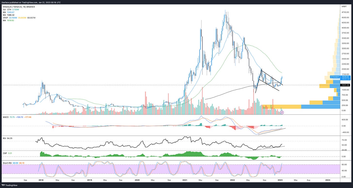
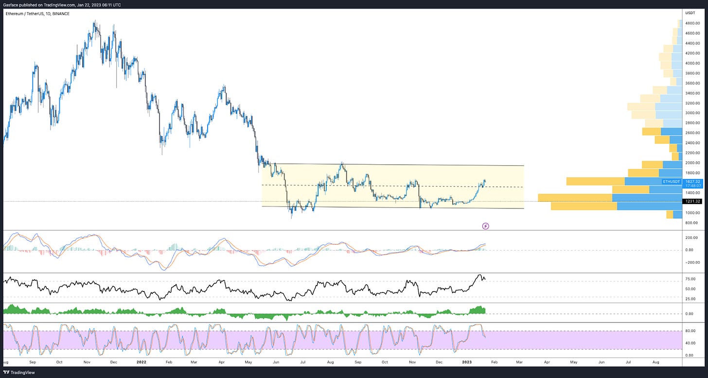
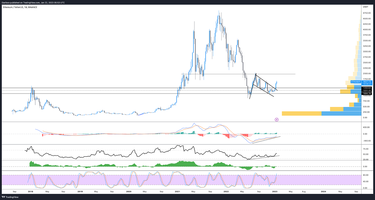
Ethereum has also been making moves lately and the price is approaching the challenging $1,700 to $2,000 zone. In Low’n slow is the way to go I zoomed in on a bull flag on ETH’s weekly time frame and this pattern reached completion and broke out on Jan. 10.
While price rejected at $1,680, the $1,700 to $2,000 zone is expected to be resilient, but like Bitcoin, there’s a lot of confluence between Ethereum’s technical, on-chain and DeFi metrics.
Let’s fly through a few charts.
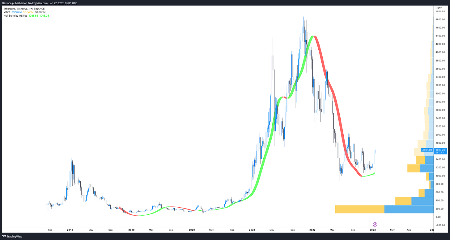
HMA flipped green on the weekly? Check.
ETH price continues to consolidate within a tight range extending from $1,000 to $2,000, with the current $1,600 to $1,900 level functioning as resistance. Check.
Bullish divergences on the MACD and RSI played out, bull flag breakout confirmed on the weekly timeframe, resistance expected at $2,000. Check.
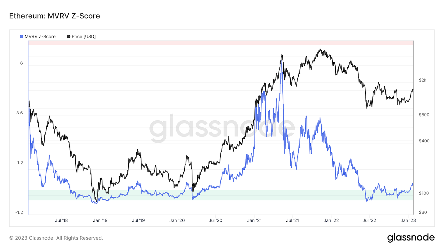
And a rather interesting on-chain metric for ETH recently cropped up. Like Bitcoin, ETH’s MVRV Z-Score recently journeyed out of the ‘green zone’ that marked price bottoms in January 2020 and July 2022.
Of course Z-Score readings outside of the green zone can throw a headfake if interpreted in pure isolation, but given the strength of the ETH Shanghai unlock narrative, the upcoming liquid staking derivative wars, and the possibility of ETH price possibly making a notable market structure shift on the daily / weekly timeframe with an eventual higher high above $1,700 to $1,800, the indicator is confluent with the current bullish view on the altcoin.
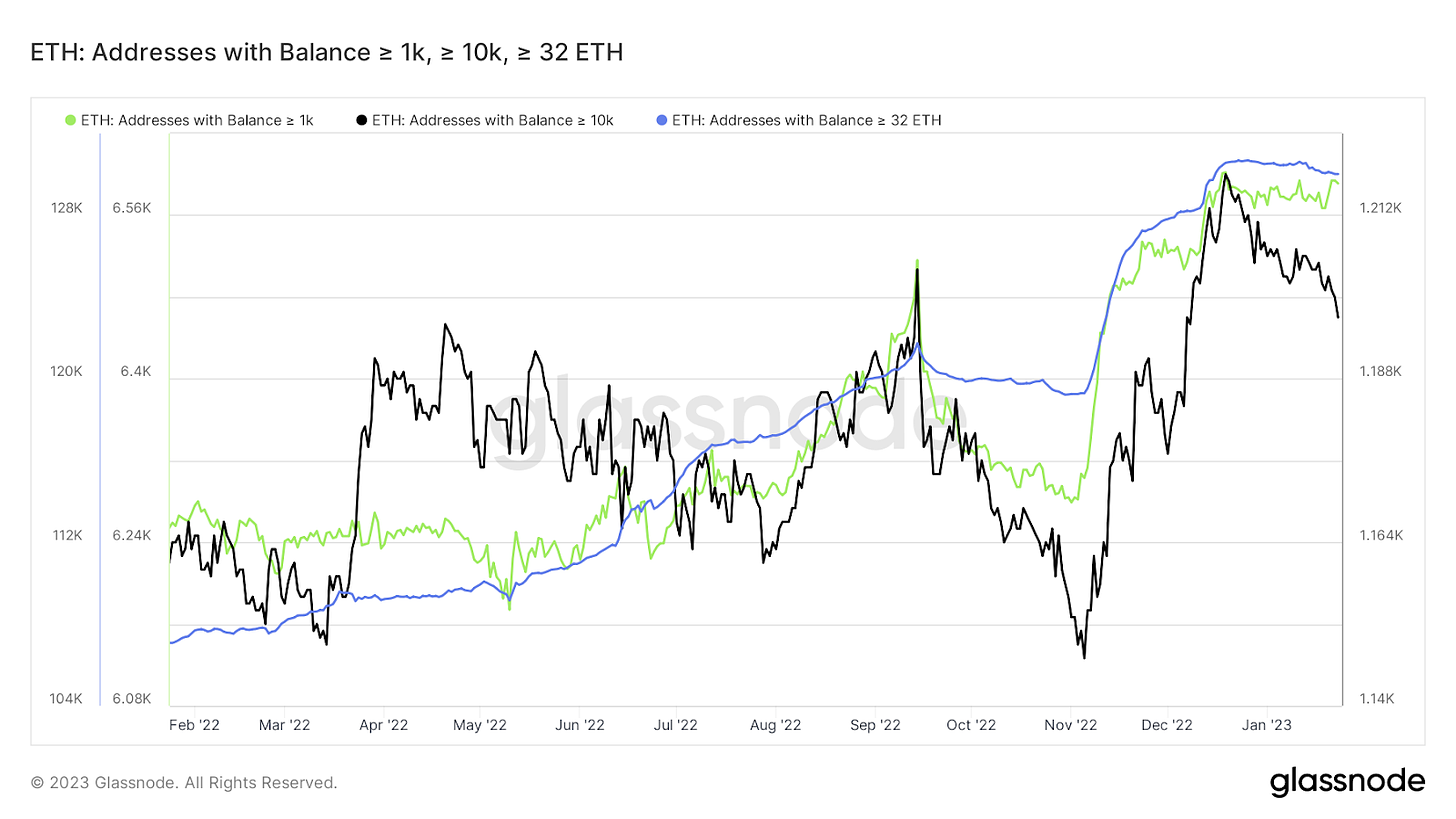
Hopium aside, one chart that did catch my attention was the wallet balance stats for multiple ETH holder cohorts. Since November 2022, we had seen ETH balances of all sizes increasing sharply, but in early January this accumulation began to taper off.
A few possible explanations could be profit taking in the current range if a number of traders who longed the $1,060 bottom anticipate some pushback in the $1,600 to $2,000 zone.
Recall that the Ethereum Merge trade was a bit of a disappointment for late comers and late longs. Given that Shanghai is set to occur in March 2023, we could be seeing the completion of the buy the rumor, sell the news trade impact that these network upgrades tend to catalyze and the smart early birds are bagging a little profit, or taking a wait and see approach as Shanghai approaches.
At the same time that ETH accumulation took a pause, liquid staked derivative governance tokens like Lido (LDO), FRAX (FRX) and Rocket Pool (RPL) went on a near parabolic tear, with each gaining triple digits in a 30-day timespan. It’s possible that traders aped into that momentum temporarily instead of adding more to their ETH longs.
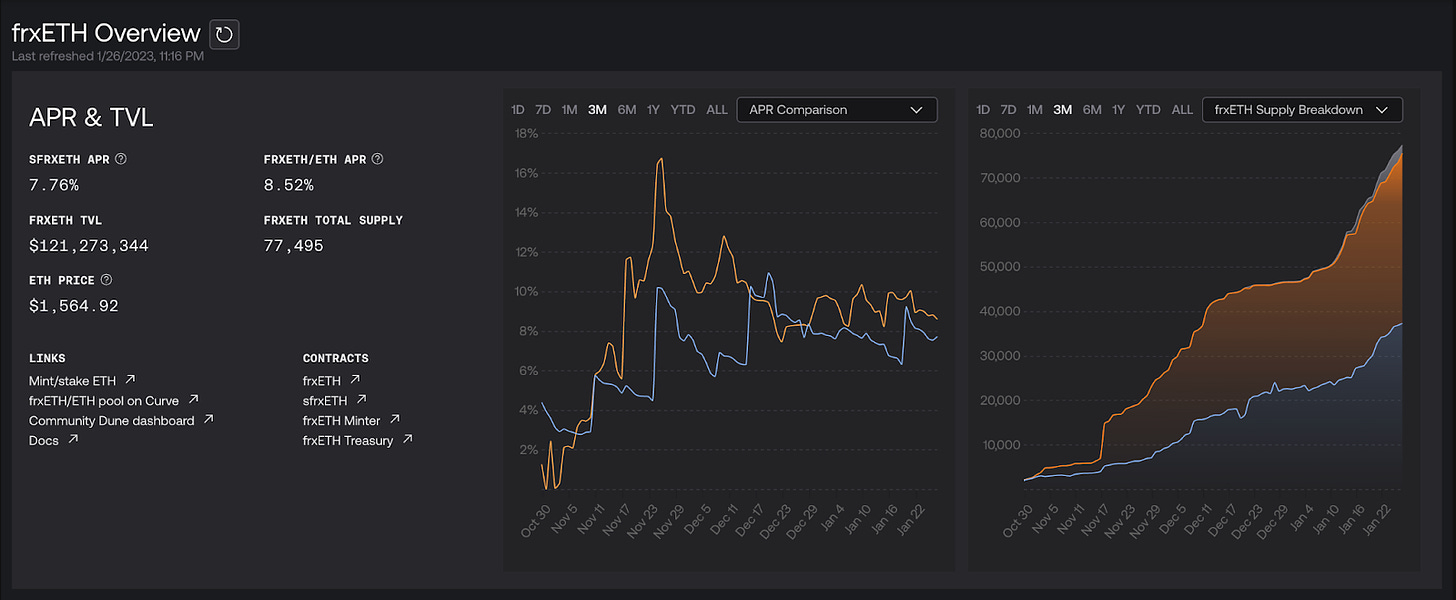
On-chain data from FRAX does show a pretty intense uptick in staked FXS and staked ETH at their platform, all for a juicy, market-beating 10% APY.
Look at the last 3 months of frxETH supply (chart on the right) that has entered the Frax protocol.
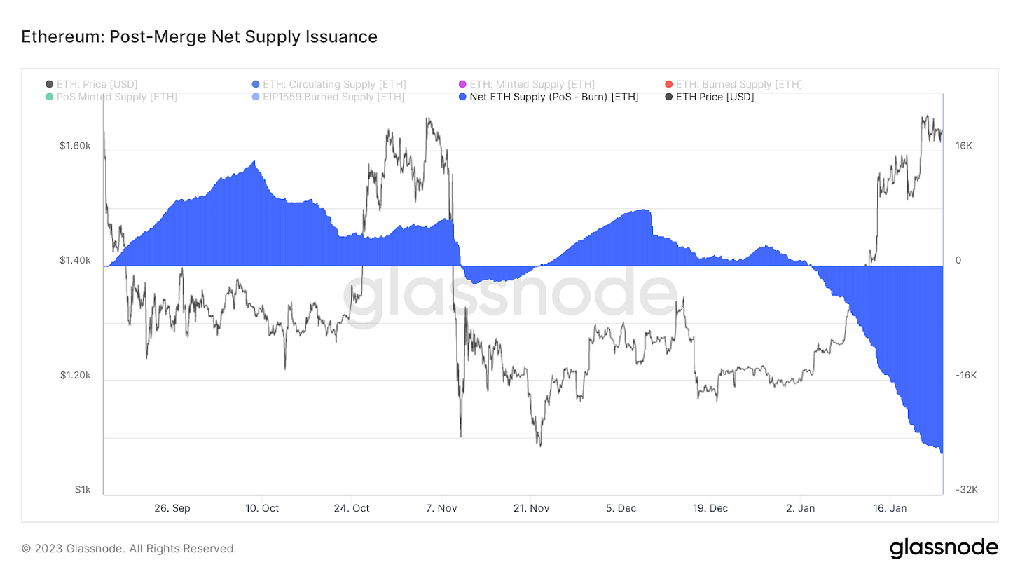
Let’s also not forget that Ether is meant to be deflationary in the proof-of-stake era.
Things are getting quite interesting. NFT volumes are picking up, the Shanghai unlock is coming in March, the LSD wars could possibly spin up a surge of activity within DeFi and ETH might be on the verge of functioning more like a bond or treasury than a purely speculative asset.
This all makes the chart below really thought provoking.
Perhaps we’ll discuss it more next time…
Where do we go from here?
Well, this thing is getting pretty long in the tooth. Substack does have limits and I’m sure your attention span also has a limit.
But, smoking meat takes time and it can’t be rushed. Rushing leads to mistakes. Mistakes lead to tough meat, sub-optimal bark, un-rendered fat, and disappointment. You gotta make hay when the sun shines, and right now the sun is shining.
Bear markets are essentially a chance to sit down, stop trading, research, figure out what worked in the previous cycle and where mistakes were made. Then plan better, and seize the day the next time opportunity presents itself.
So before we wrap up, here’s a snack for the road.
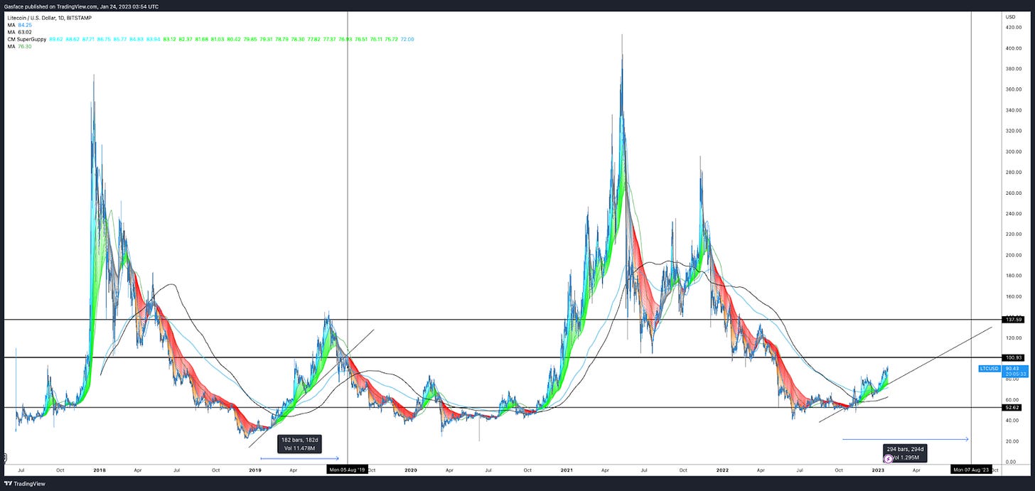
The Litecoin (LTC) halving narrative remains in full effect. The GMMA is bright green on the daily and weekly chart. The HMA is also showing a beautifully thick green ribbon on the same time frames.
Price is respecting the ascending trendline, riding along the 20-MA, and the 20 and 50-MA crossed long ago + LTC price trades above the 200-MA. Looking at LTC’s price action during the previous halving cycle, the current price action is basically a carbon copy.
Could things fall apart?
Sure, but the charts and narrative right now are pretty compelling.
Until next time friends! Do research, make a plan and trade carefully!
Follow my grilling adventures and trades @big_smokey1 on Twitter.
The views expressed here are not intended to serve as trading advice. The author is not paid to analyze any of the assets mentioned above and know that I may or may not hold positions in the mentioned assets. Please be safe and DYOR.


